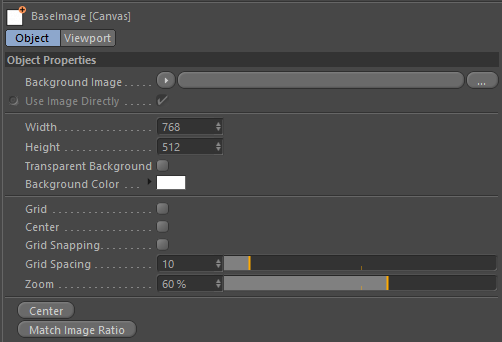

Drag and Drop and image from the Content View, from disk, or manually select, and this image will be used.
When enabled it will use the image directly and not sample it via a shader.
The width of the Canvas in pixels.
The height of the Canvas in pixels.
When enabled the canvas will have a transparent background.
Sets the color to display in the background. This color is not used when Transparent Background is set.
Display a grid overlay on the image.
When enabled it will centers the grid display so that there is a horizontal and vertical line through the center of the Canvas. When disabled it will incrementally draw lines starting from the top left of the Canvas based on the Grid Spacing value.
Enable grid snapping when drawing new shapes onto the canvas.
Set the size of the grid spacing in pixels.
Zoom in and out of the canvas.
Note that you can also use the middle mouse wheel to zoom in and out as well. Pan the image by holding down the middle mouse button.
Resets the zoom to 100% and centers the Canvas in the center of the viewport.
If you have an image in the Background Image then it will fill the entire Canvas. Pressing this button will make the width and height ratio of the canvas match that of the image used so that the ratio is the same.